As the cornerstone of Lander University’s visual identity, the Tower Logo (The Logo) serves as the primary – and most recognizable – element of the University’s brand.
Inspired by the iconic tower of Laura Lander Hall, the primary Logo is a powerful symbol that helps establish Lander University’s presence, build recognition, foster trust, and communicate key aspects of the Institution’s values.
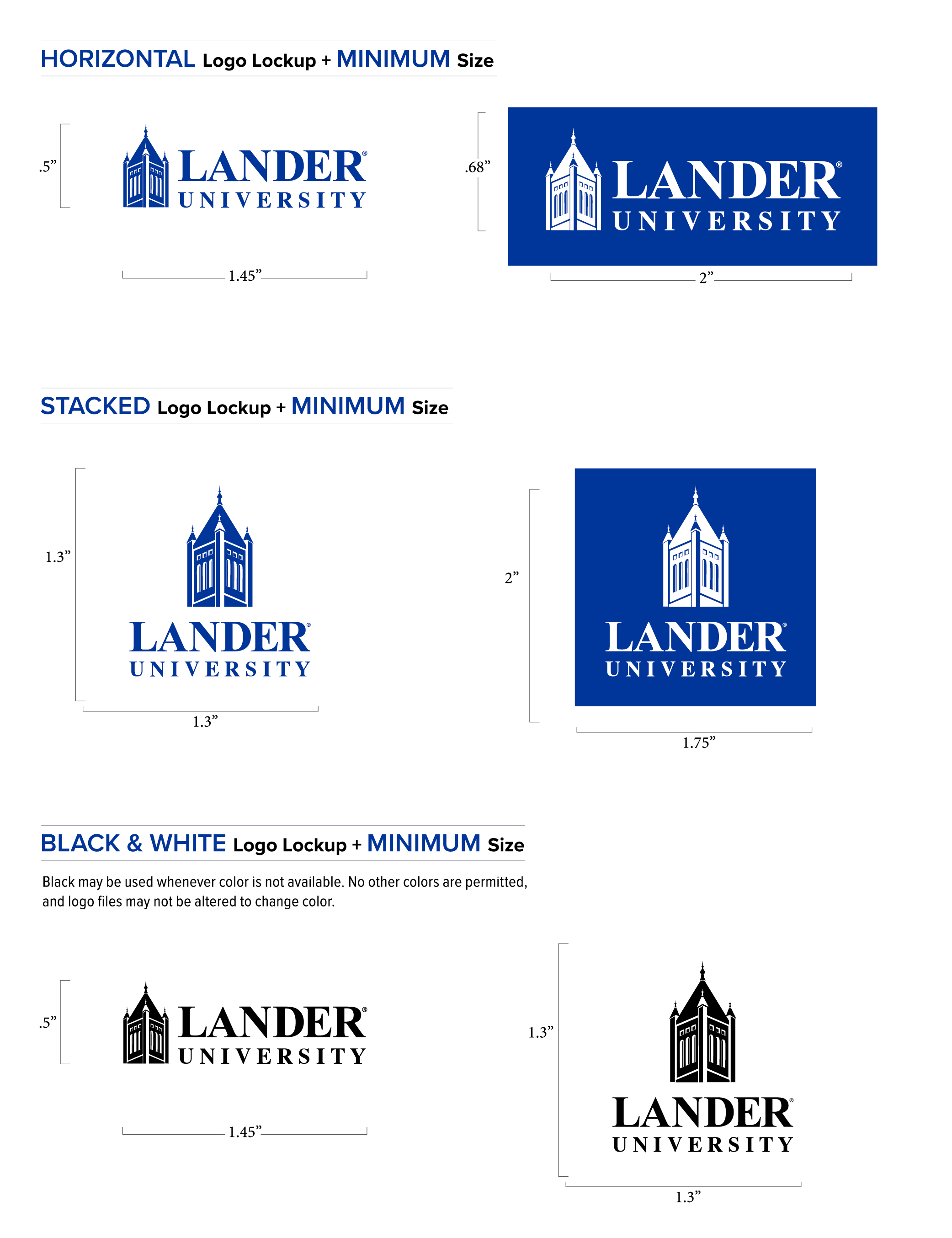
The Logo consists of two styles: a horizontal layout, which is preferred, and a stacked layout, appropriate for use when the horizontal logo does not fit within a particular design or space. In both styles, the logo’s two elements—the wordmark and tower—work in concert with one another and should not be modified or resized in any way.
Approved colors for the logo are Legacy Blue (PMS 661C) and white. Black may be used whenever color is not available. No other colors are permitted, and logo files may not be altered to change color.
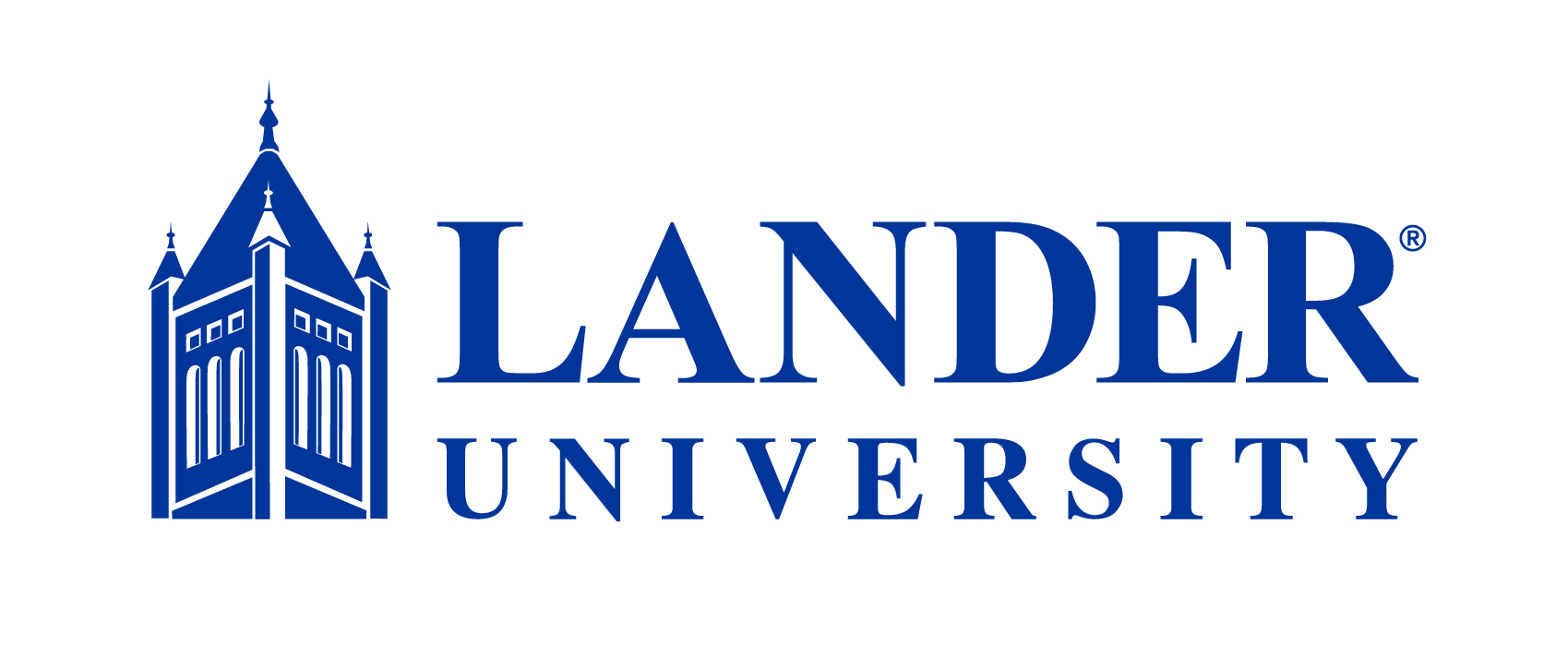
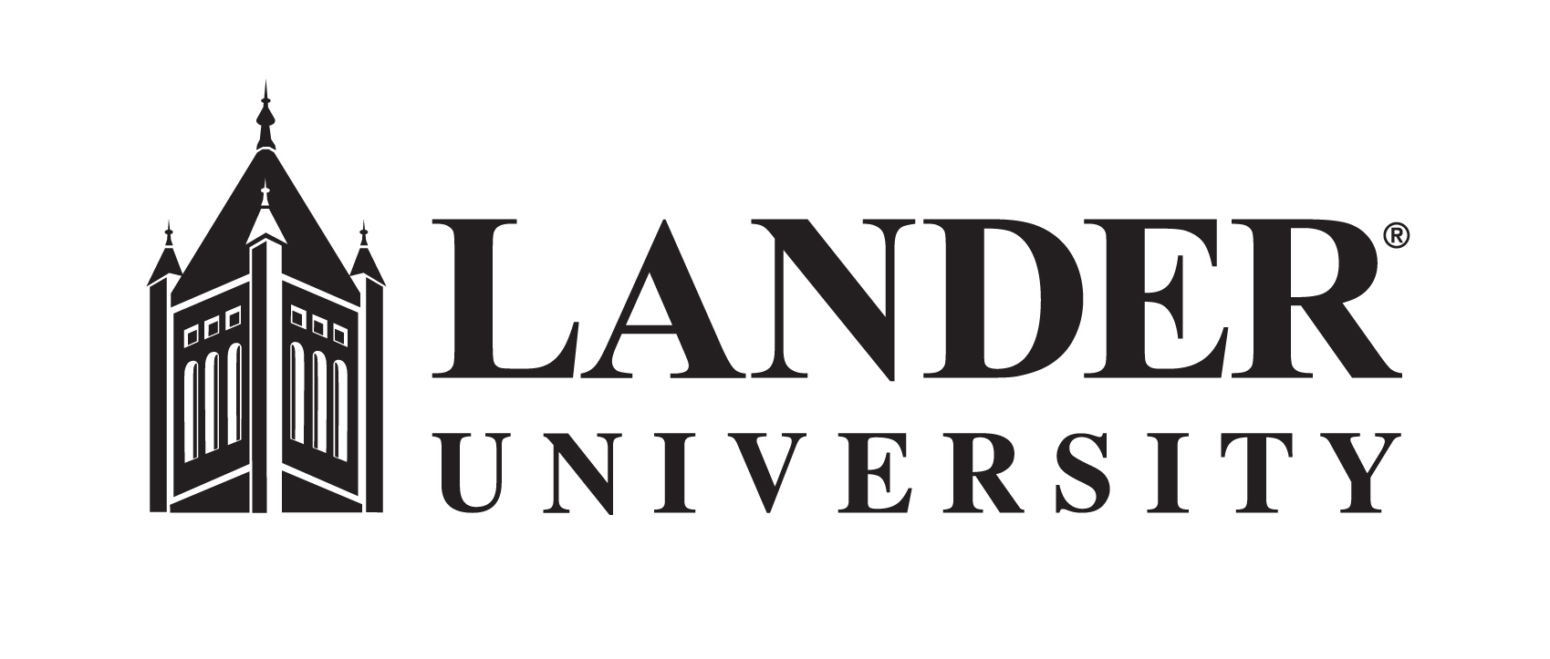
Horizontal Primary Logo
![]()
Black may be used whenever color is not
available.
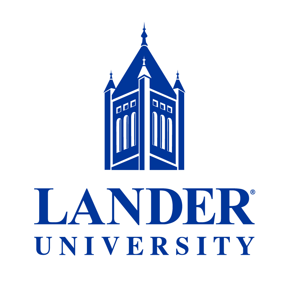
Stacked Primary Logo
![]()
Black may be used whenever color is not
available.

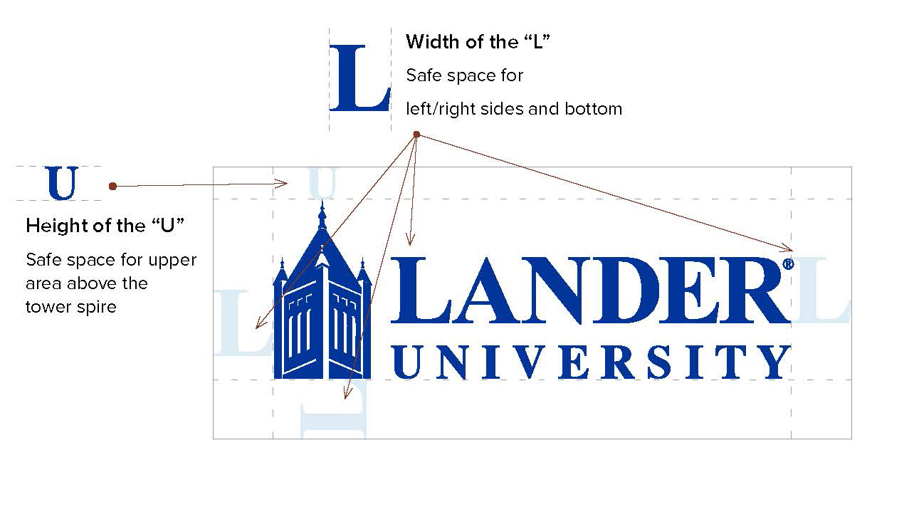
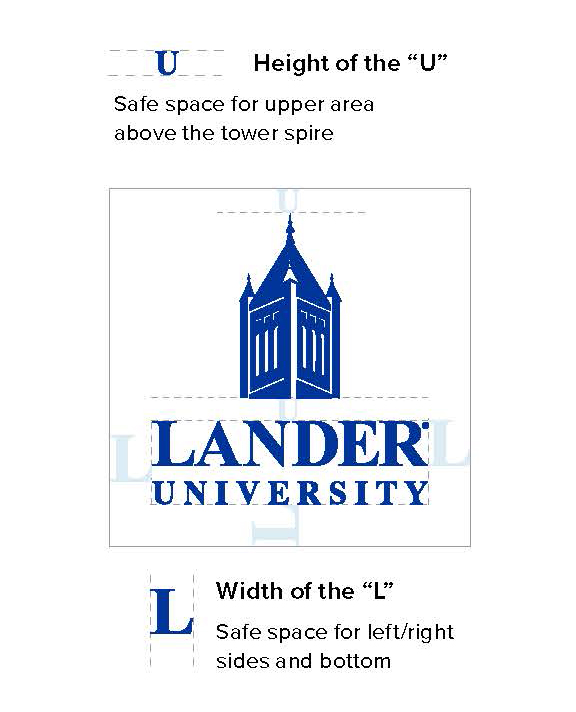
Clear Space Requirements
Clear space, also known as safe space or padding, refers to the area surrounding the logo that should be kept free of other elements, such as graphics, text or images. Clear space ensures that the Lander University logo has maximum legibility and flexibility across all media.
Giving the logo this room to breathe and be noticed is important for building brand awareness and contributes to a more polished, professional brand image. Photos and colors may appear beneath the logo, so long as the logo remains easily visible and recognizable.
Specific elements of the logo are used to demonstrate appropriate safe space on each side of the logo. Logo lockups are constructed with this safe space in mind, with the appropriately sized frame (bounding box) surrounding the logo. Users need only to place the logo into their design without cropping into or stretching this frame.
Size Requirements
When Lander Blue or black is used in printing the logo, the minimum width for the logo is 1.45” inches. When the logo appears as a white knockout on a color background, the minimum width is 2 inches.
Usage Guidelines
The Logo acts as a signature of the University to the world, and as such, it is to be used on all institutional publications. It should be the first choice whenever a Lander University logo is used.
Athletics Logos
The Bearcat logo is mainly to be used by Athletics and related programs. Please refer to the Lander Athletics website for the Lander Bearcats Brand Guidelines.

Level System Overview
Level Two - University Academic Seal and Other Restricted Marks
There are a number of logo marks associated with the University in addition to the official University logo. Each of these marks has specific usage criteria and guidelines. In general, they should not be considered for primary use.
Level Three - Colleges and Division Lockups
Level Three logos are a way of branding individual areas within the University. The specific logo lockup is called the "Companion" logo.
For more information about the University's logo, please consult the Lander Branding & Style Guide.