Typography plays a significant role in how Lander communicates our brand identity through written text. Establishing a brand font helps create a consistent, recognizable identity across all materials, from brochures to websites.
Lander brand fonts have been carefully chosen for legibility, communication and accessibility. When developing official communications, these should be the primary fonts used; however, it is important to remember that each communication project will drive specifically how the type is used to tell our story.
The official University typefaces are Proxima Nova, Arial, EB Garamond, and Times New Roman.
Primary San Serif Font
Proxima Nova
Proxima Nova is the official sans serif font family for use in Lander’s marketing and communications. A distinguishing feature of Proxima Nova is its excellent readability, clean lines, and wide range of weights and widths.

Installation:
Proxima Nova is available to faculty, staff and students through the Adobe Creative Suite (Adobe Fonts). To install:
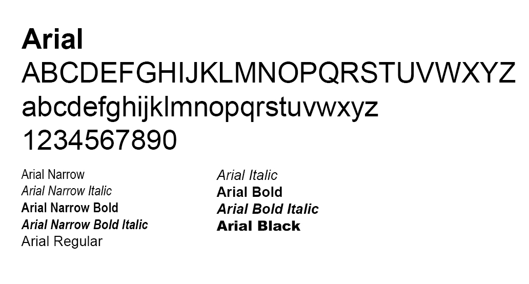
Functional Font: Arial
When Proxima Nova is not available, or when you are collaborating on a document with an individual who does not have access to Proxima Nova, the University’s functional sans serif font, Arial, may be used. Similar to Proxima Nova, Arial is a sans serif type face with easy legibility and a variety of available weights and widths. Arial is a Microsoft font that is included with all current versions of Microsoft Windows and is readily available for most PC users, both on and off campus.
Primary Serif Font
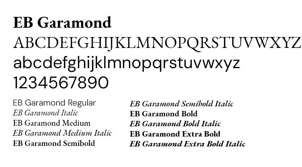
EB Garamond
EB Garamond is Lander’s primary serif font family, evoking a sense of credibility, professionalism and historical significance. A large font family, EB Garamond is a revival of the classic Garamond design by Claude Garamond, based on a 1592 specimen known as the “Berner specimen.” It is considered one of the best open-source Garamond implementations, designed by Georg Mayr-Duffner.
Installation
EB Garamond is available to faculty, staff and students through the Adobe Creative Suite and Google Fonts.
Adobe Fonts
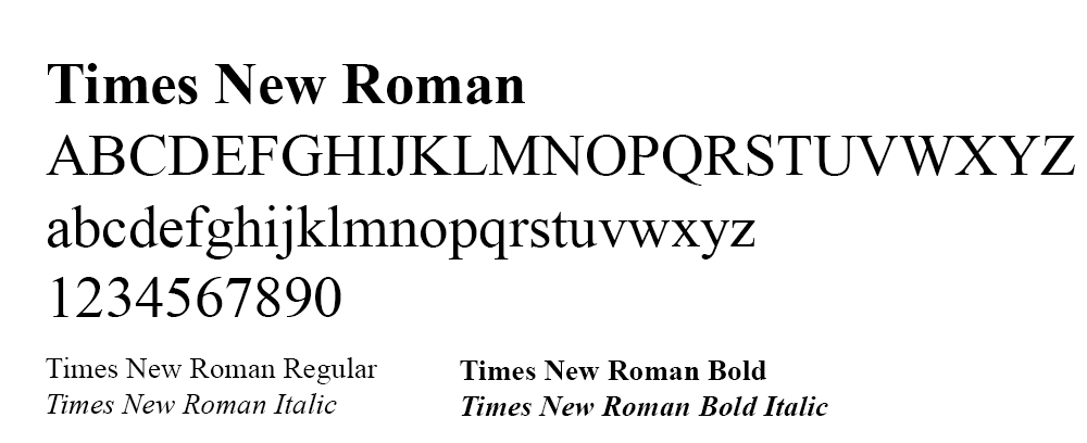
Functional Font: Times New Roman
When EB Garamond is not available, or when you are collaborating on a document with an individual who does not have access to EB Garamond, the University’s functional serif font, Times New Roman, may be used. With its strong historical pedigree, Times New Roman is used by many institutions because of its association with readability, versatility and longevity. It is widely available on most operating systems and software, reducing the possibility of font compatibility issues.
If you have any trouble downloading and installing the fonts, please reach out to either the campus ITS Help Desk or University Marketing & Communications.
Usage & Fonts
Below are examples of how to use the Lander University typefaces in the design of text for marketing and internal materials. In most cases a suitable body copy size for reading is anywhere between 9- to 12-point type. This sentence is in 10-point type. However, point size is not consistent across fonts:
Examples

Tips