Our color palette helps us express our personality and elevate our identity — leading with Legacy Blue and Medallion Gold. Using color appropriately is one of the easiest ways to make sure our materials reflect a cohesive image or visual story. The Lander University color palette has two layers: primary and secondary palettes.
Primary Color Palette
|
Legacy Blue PMS 661-C |

Medallion PMS 3514-C |
Golden Claw PMS 115-C |
Accent Color Palette
To be used sparingly and never as the main color theme.
|
Mineral Spring PMS 7690-C |

Fountain Mist PMS 290-C |
Stanley Avenue PMS Cool Gray 7-C |
Clean Slate PMS Cool Gray 3-C |
Midnight Blue PMS Dark Blue |
||||
|
Tower Bricks PMS 1685-C |

Campus Columns PMS 7506-C |
Front Lawn PMS 349-C |
Bronze Medallion RGB 153, 105, 0 |
Color Hierarchy
Primary Color Palette
Our primary palette will always include Legacy Blue and Medallion (Gold), paired with Golden Claw (yellow). These colors should be present in almost all marketing and communications materials.
Secondary Color Palette
Our secondary color palette is designed to complement our primary palette and includes shades that accent and add depth and dimension to our primary colors. They may also be used for data visualization and illustration. Additionally, correct use of the brand palette ensures accessibility and legibility in print and digital applications.
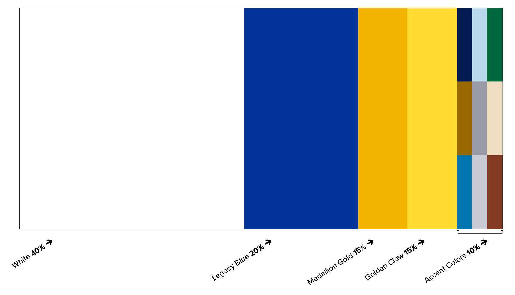
Golden Claw Exception
Although Golden Claw is featured in the Primary color palette, this color is almost always treated as a secondary color and is to be used minimally, supporting the primary palette. In the proportions chart below, Golden Claw's recommended use is shown in relation to the mast brand.
Guidelines for Usage
Do
Don’t
Proportions
Use the proportions on this page as a general guideline for applying color to layouts.
While these exact ratios may not fit every situation, it’s crucial to consider the relative
impact of each color.
Embrace the white space! Using white space as a pause allows the audience’s eyes
to rest and embrace the information and content more effectively. It is a necessity and
increases the overall balance and legibility of a design. It helps to focus the content
and the attention of the viewer on primary information.
Contrast
Contrast is important in designs because it helps make text and visual elements stand out, improving legibility and guiding the viewer’s attention. Proper contrast between text/visual elements and background colors ensures your content is easy to read for everyone. For example, dark text on a light background, or light text on a dark background, provides strong contrast that makes content more accessible to a wider audience.
A helpful resource for checking contrast can be found at WebAIM. WebAIM (Web Accessibility In Mind) has provided comprehensive web accessibility solutions since 1999. As a non-profit service center at Utah State University, WebAIM’s mission is to expand the potential of the web for people with disabilities.
For more information about the University's color palette, please consult the Lander Branding & Style Guide.